Crunching CG scene into an embroiderable design
Following the false start with the Océ, I wanted to find another way to put the computer generated zoetrope design to good use. I could have simply embroidered the cubes alone, but by removing all the lighting and shadow information from the ground plane, the whole scene would have become pretty meaningless.
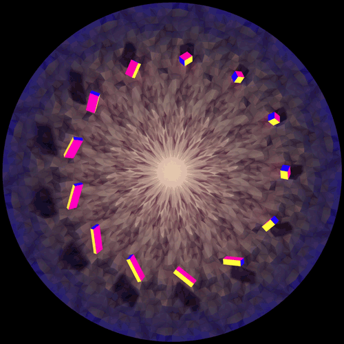
Using Processing, I wrote a sketch which reads my original CG render and generates a radial grid of coloured shapes corresponding to the colours of the pixels closest in proximity. The animation below demonstrates how the grid looks when each shape corresponds directly. For example, if one of the shapes is positioned exactly where a blue pixel is in the original image, the shape will be coloured blue.
This works well and gives a nice effect, however in the context of embroidery, it means that you would need to use a different coloured thread for almost every shape. Not only does each hue have to be accounted for, but also each step of brightness and other variations of colour. This simply isn’t possible, not only due to the hardware limit of 15 threads on the embroidery machine at one time, but also due to the prohibitive cost in sourcing those colours. I needed a better solution.
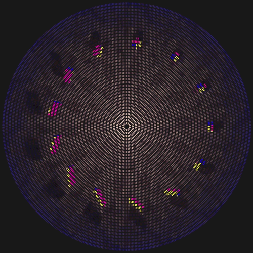
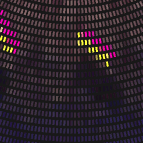
My next iteration borrowed the basic principles of additive colour, the same principle used by monitors to display a broad spectrum of colour using only three basic elements; red, green and blue. I modified my script to gather the colour values at each given point, and instead of copying them directly, I converted them into their respective RGB values. This allowed me to represent the same image using only three colours for the shapes. My system behaves slightly differently to traditional displays, as it actually increases the size of each ‘sub-pixel’ instead of increasing it’s intensity.
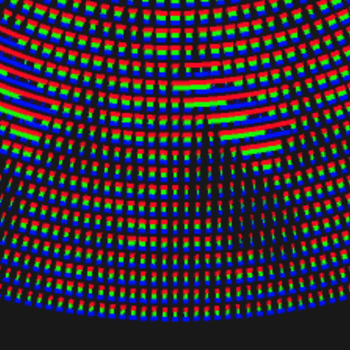
The image above is comprised entirely of shapes of only three colours, each at varying sizes. Thanks to this reduction of colour, it would be possible, at least in theory, to embroider this design. Unfortunately, the large number of points, 18,270 in this instance, at the relatively small scale of the discs I am creating would prove too dense for the embroidery machine I have access to. Naturally, I wanted to tweak my code and reduce it even further.
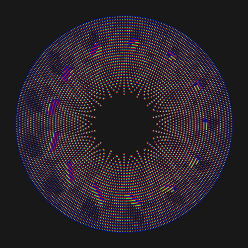
The following image is the result of reducing the design to its essentials. This was basically the sweet spot between the fewest lines and maintaining a somewhat discernible image.
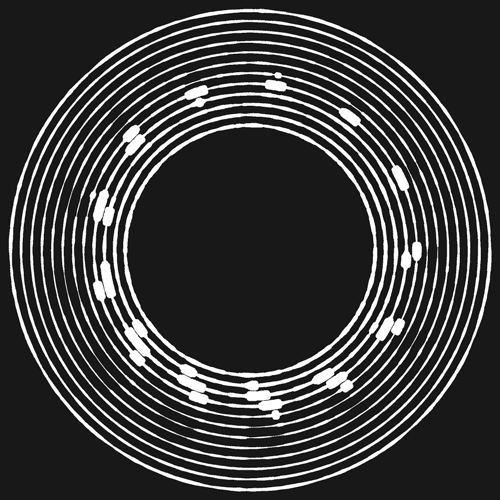
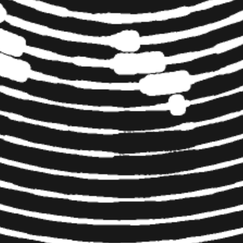
This pattern is far better suited to embroidery, as it would require only twelve concentric satin stitches. Of course this is an extreme reduction of definition, and upon arriving at this result I began to realise that I was only really continuing as a fun challenge rather than working towards an acceptable final design.
One positive and unexpected side-effect of this final exercise was that the white, circular rings began to take on the appearance of sound waves. Given the context of the turntables on which these discs will be ‘played’, it has given me some new ideas about building upon the relationship between vision and sound that my original project only began to scrape the surface of.